NeuGen Power
AI energy assistant and design system
Meet Nova: an AI energy assistant that makes managing your energy calm, clear and effortless.
Background
This project was set by Glasgow Caledonian University for the Visual Design & Prototyping module, in partnership with Scottish Power. The brief introduced NeuGen Power, a fictional new sub-company, and asked us to design the UI and design system for its AI energy assistant.
Client
NeuGen Power is a new sub-company of Scottish Power, part of the Iberdrola Group. Like its parent company, it generates 100% green electricity, with a focus on wind energy, smart grids and other new technologies. NeuGen wants to engage a new, younger generation of customers.
Brief
NeuGen Power has developed an AI Energy Assistant, and needs a UI and design system that communicates its values while resonating with a younger audience.
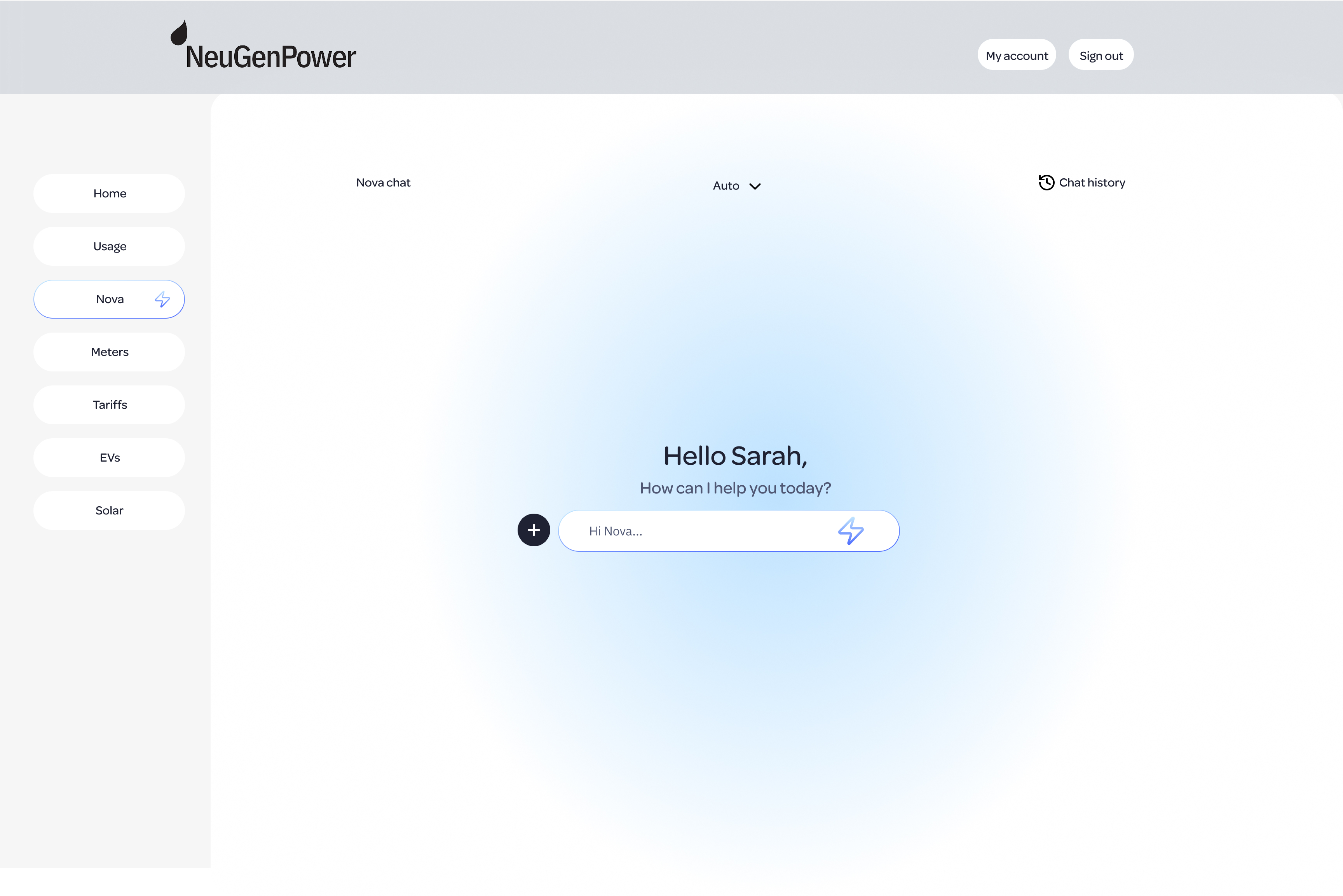
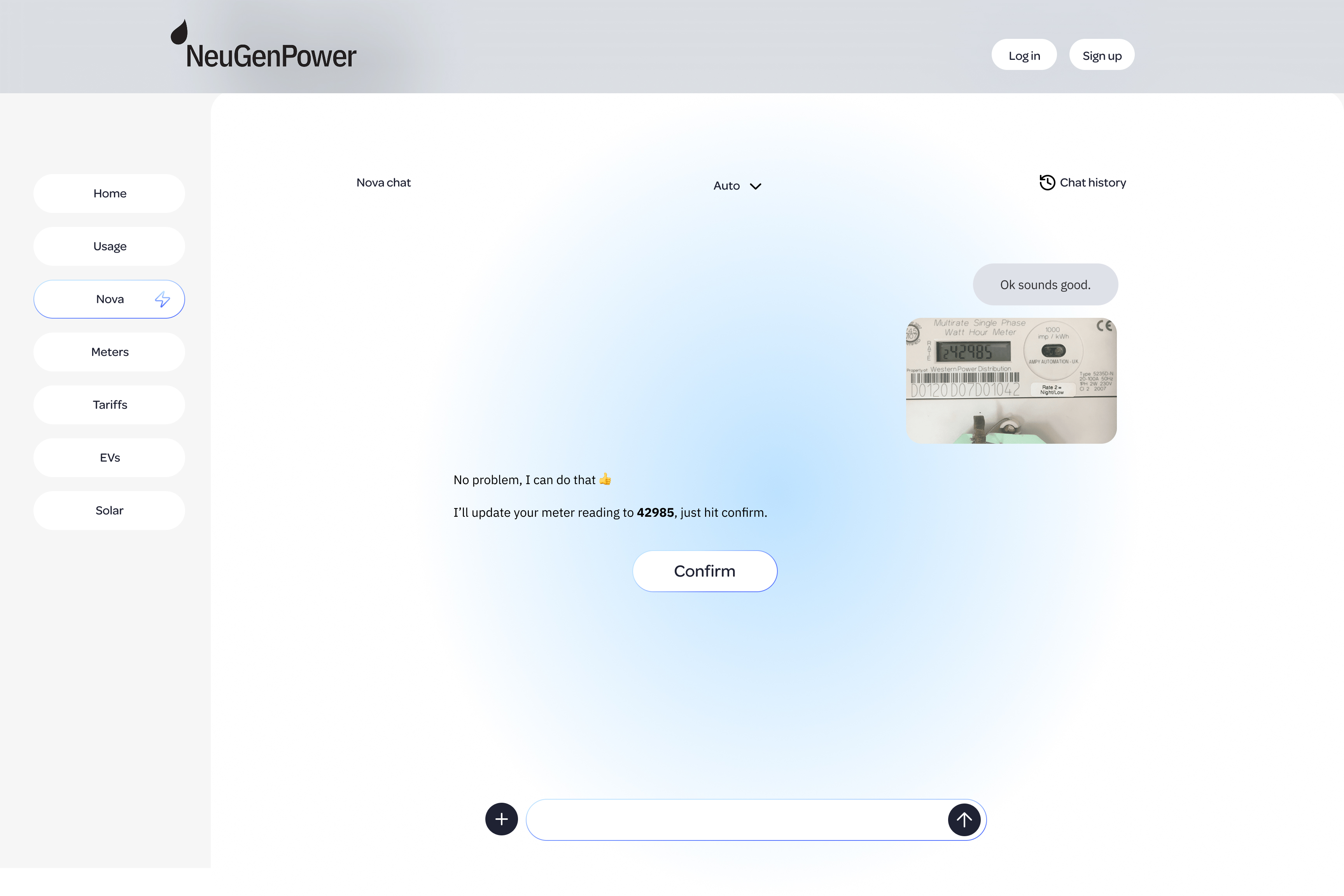
I designed Nova, an agentic AI assistant that lives inside NeuGen’s website.
1 / Research
Overview
- Who it’s for
- Personas
- Competitor analysis
Who it's for
NeuGen Power's brief targets a “new generation” of energy users, focusing on 25 to 35 year olds. Early research demonstrated that this population is renting or buying their first homes and are often managing energy bills on their own for the first time.
Because this product is an AI tool it was also important to consider this demographic's differing relationships with technology.
Personas
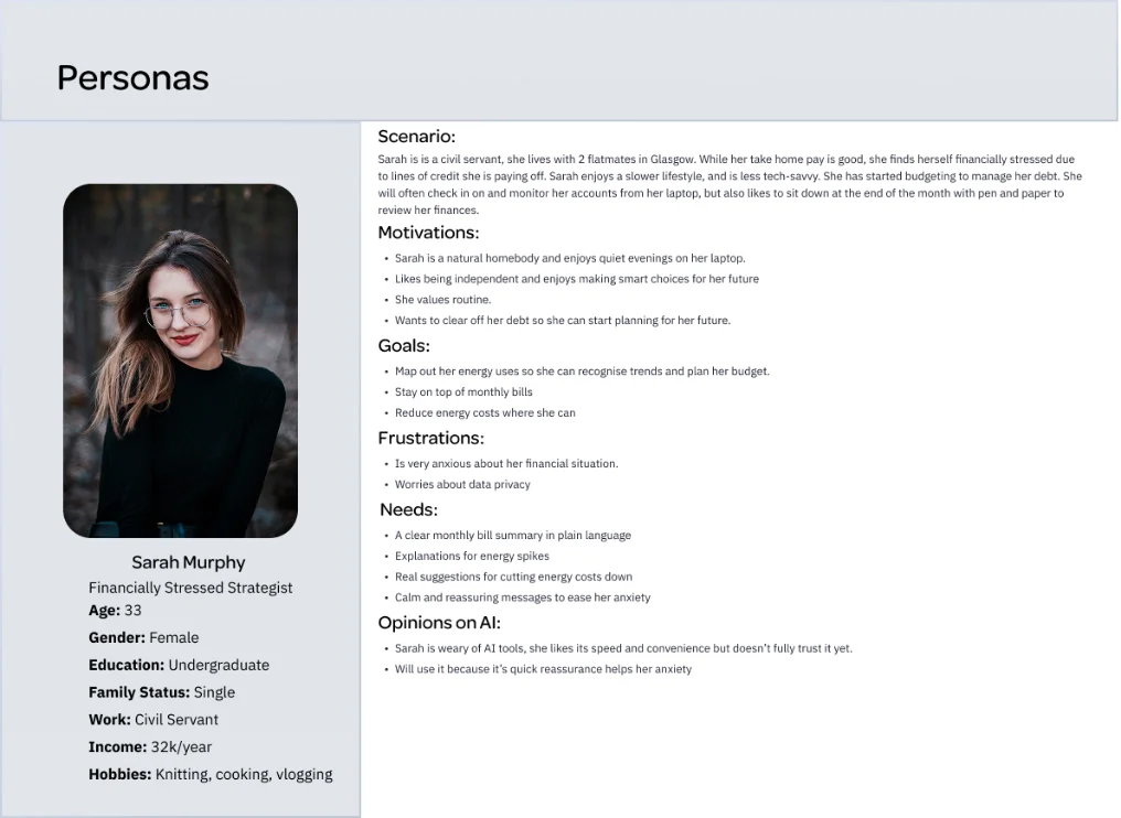
I used my research and turned the research into three personas, each with a different relationship to AI.
Competitor analysis
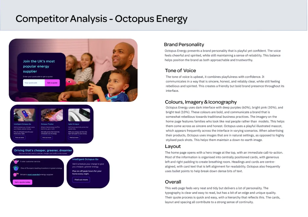
I reviewed Octopus Energy and E.ON Next as direct competitors, looking at brand personality, tone of voice, colour, imagery and layout.
I also looked at ChatGPT and Grok as indirect competitors, to understand how AI assistants handle chat layout, model switching, chat history and readability.
2 / Visual language
Overview
- Mood boards
- Style tiles
- Naming Nova
- Sketches and user journeys
- Wireframes and lo-fi prototype
Mood boards
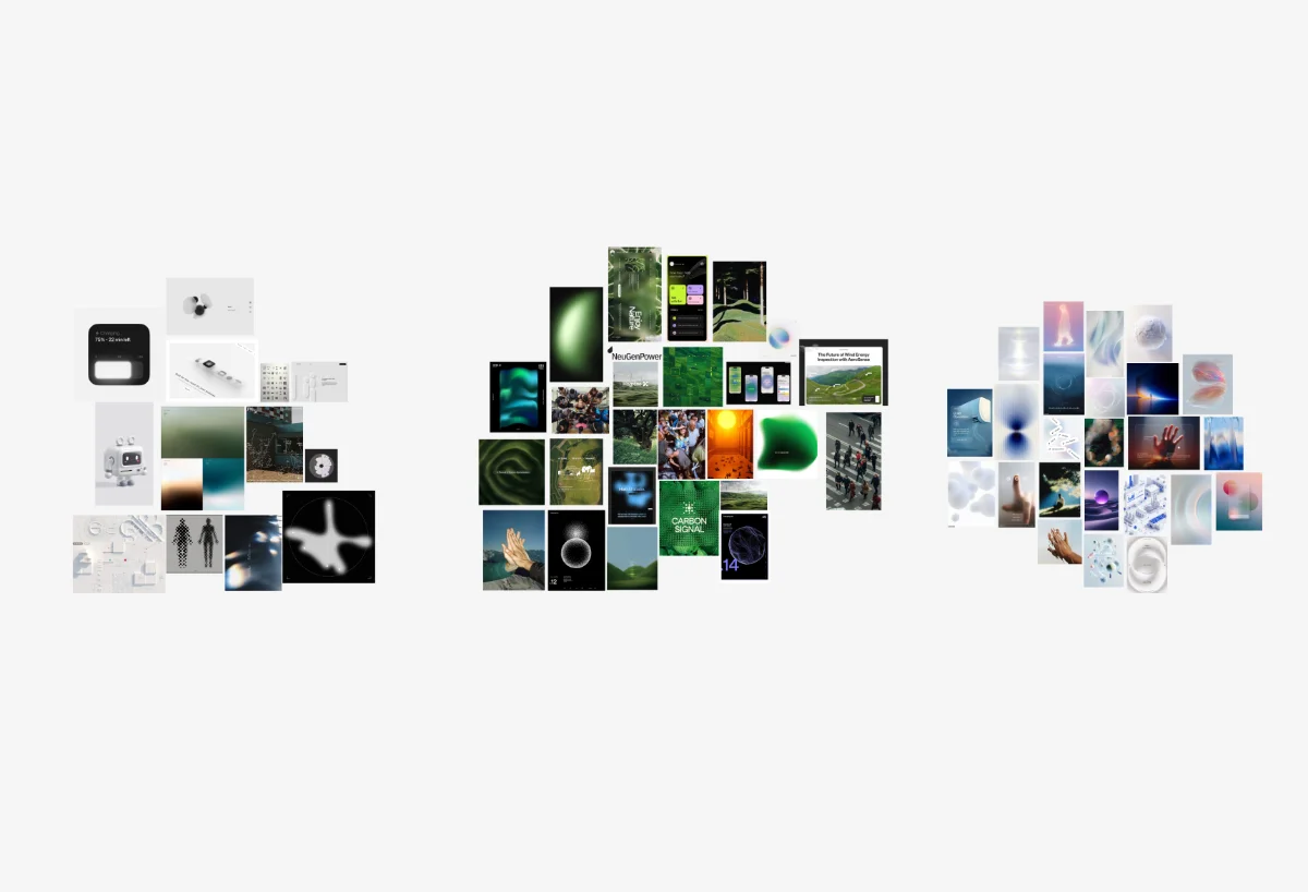
With my research, personas, and competitor analysis complete, I could begin brainstorming the visual language of the brand. I started gathering images and clustering them into different groups. I created three mood boards to start and then began the process of elimination.
Style tiles
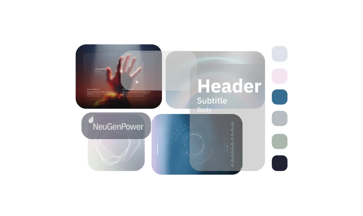
After choosing an initial mood board, I began creating a series of style tiles exploring colour, type, sizing and texture. The first came straight from the mood board, and the second brought in what I learned from competitors.
Naming Nova
I named the assistant Nova because it represents something new. Astronomically, a nova is a star that suddenly becomes much brighter, which felt right for an innovative energy brand.
Sketches and user journeys
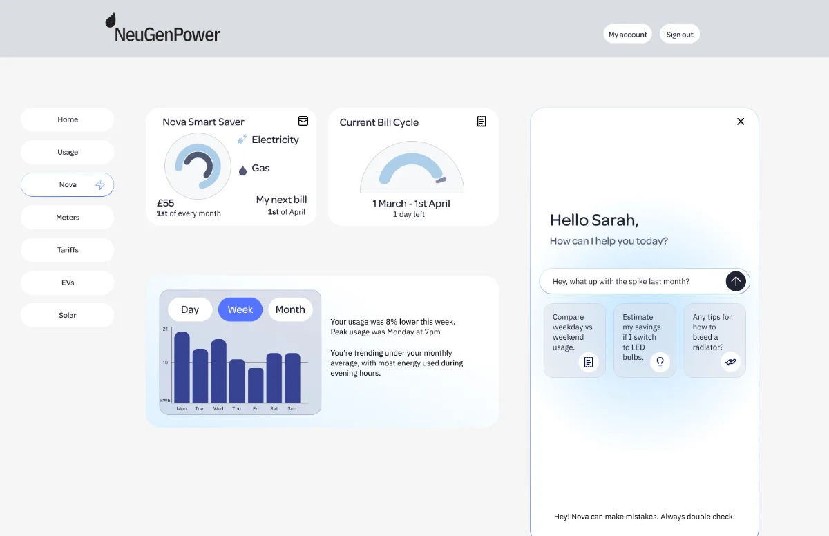
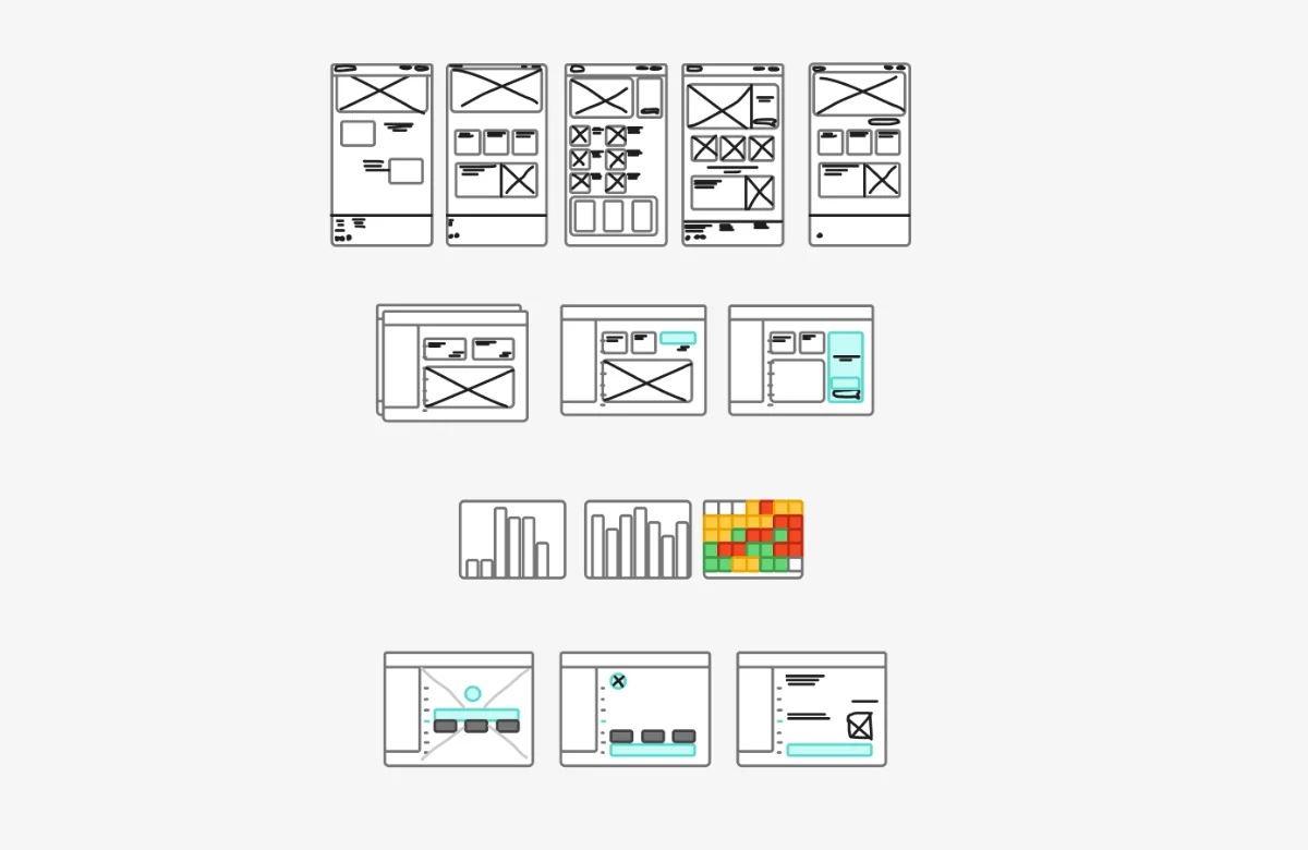
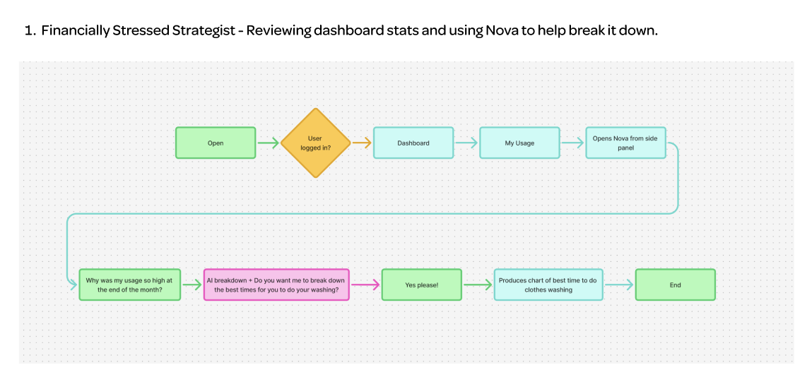
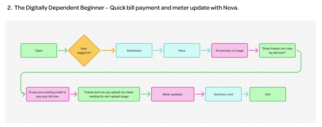
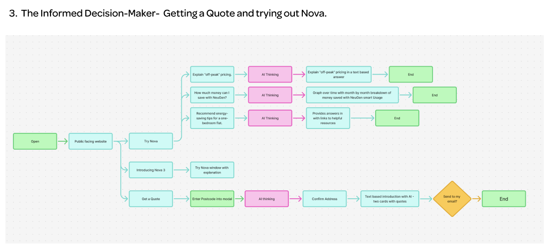
Crazy Eights helped me explore layouts for the public home page and the dashboard, and how Nova might fit into each. I then mapped a user journey for each persona: Sarah reviewing her dashboard with Nova in a side panel, Jamie paying a bill through Nova, and Gavin getting a quote. These shaped the information hierarchy of the home page.
Wireframes and lo-fi prototype
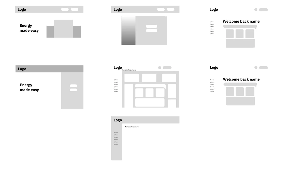
Wireframes and a lo-fi prototype let me test interactions, navigation and hierarchy, and try out images and styles as I went.
3 / Design system
Overview
- Colour
- Typography
- Components
- Refining the system
Colour
The primary brand colours are clean and restrained, with a subtle warm undertone that keeps them grounded in a natural palette. The secondary system colours are more saturated so they read clearly as interactive. bright purple and blue are reserved for Nova, and coral as a system error.
Typography
I paired Omnes, which feels modern and organic, for headings with IBM Plex Sans, the typeface of the NeuGen logo, for body text. Plex feels more technical, so the pairing reflects the blend of human and technology.
Components
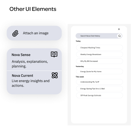
Every component was designed around a clear system status, following Nielsen’s heuristics.
- Buttons in normal, hover and clicked states, with bright blue Nova buttons and a lightning bolt icon
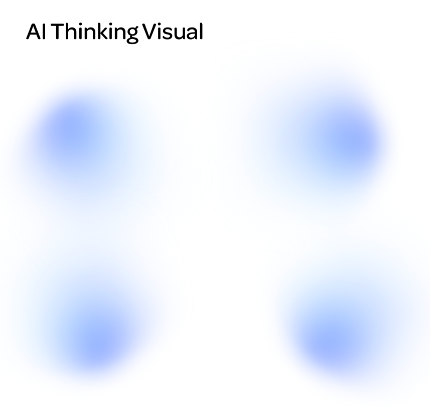
- AI thinking: a blurred, spinning blob of brand and system colours, in place of the usual spinner
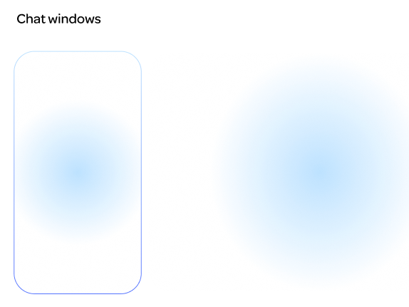
- Chat windows with a soft, moving blue gradient so Nova feels alive and distinct from customer support
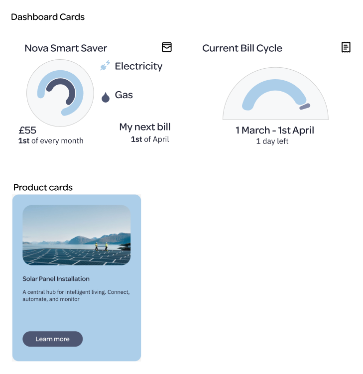
- Cards with rounded edges and simple data visualisations, and a mid-blue reserved for products
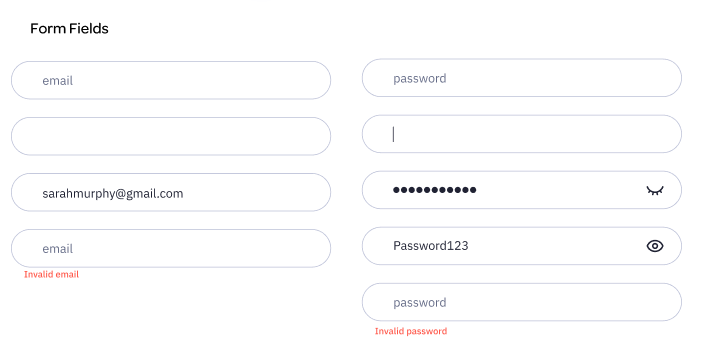
- Form fields with clear empty, filled and error states
Refining the system
Accessibility checks showed some colours were too low contrast for AA, so I revised them and added a red for errors. I also expanded the type scale, moved to a 12-column grid and 4pt spacing, dropped a script typeface for accessibility, and replaced a spinning lightning bolt with the AI thinking blob, which felt more unique.
4 / Prototype
Overview
- Home page
- Dashboard and Nova chat
Home page
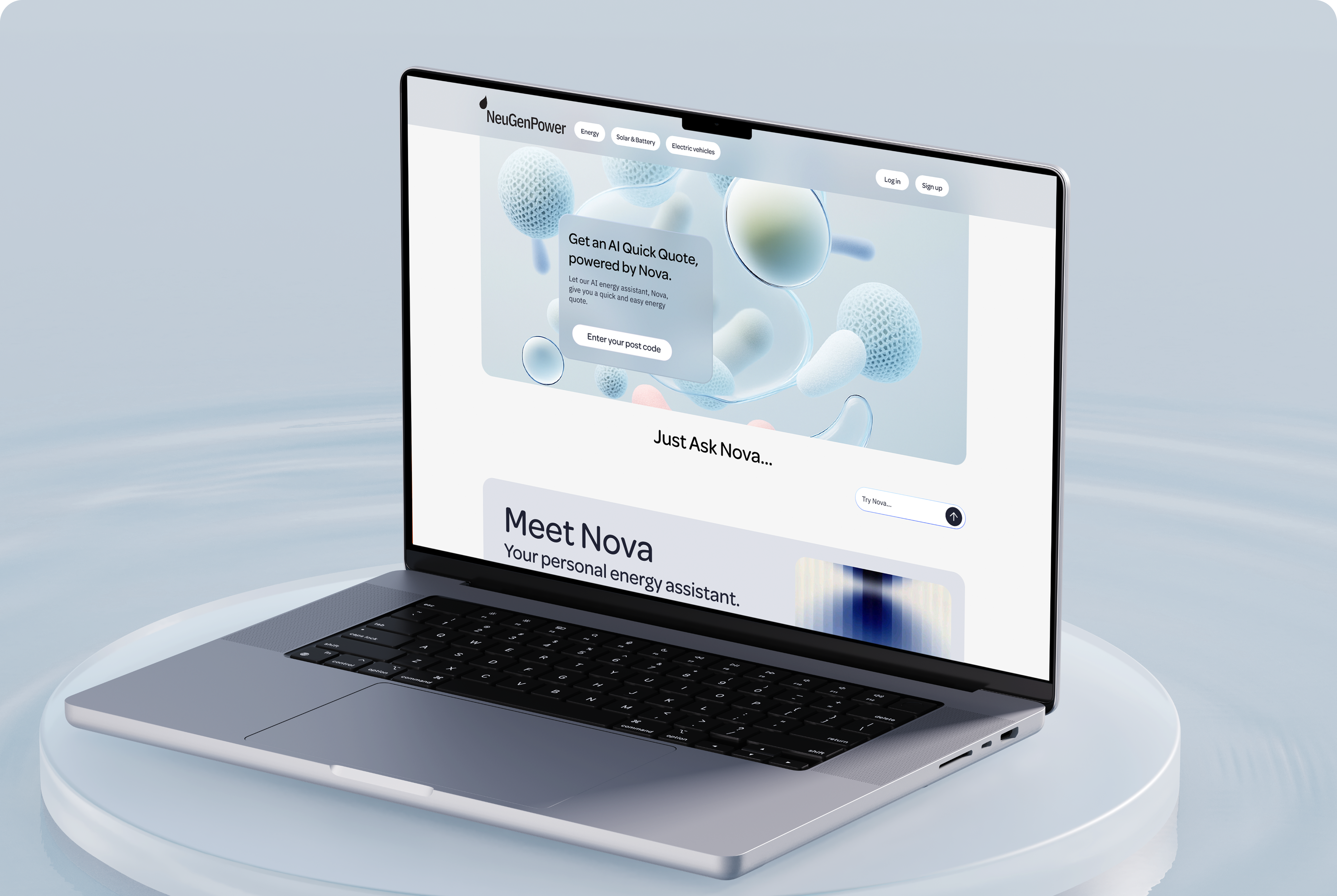
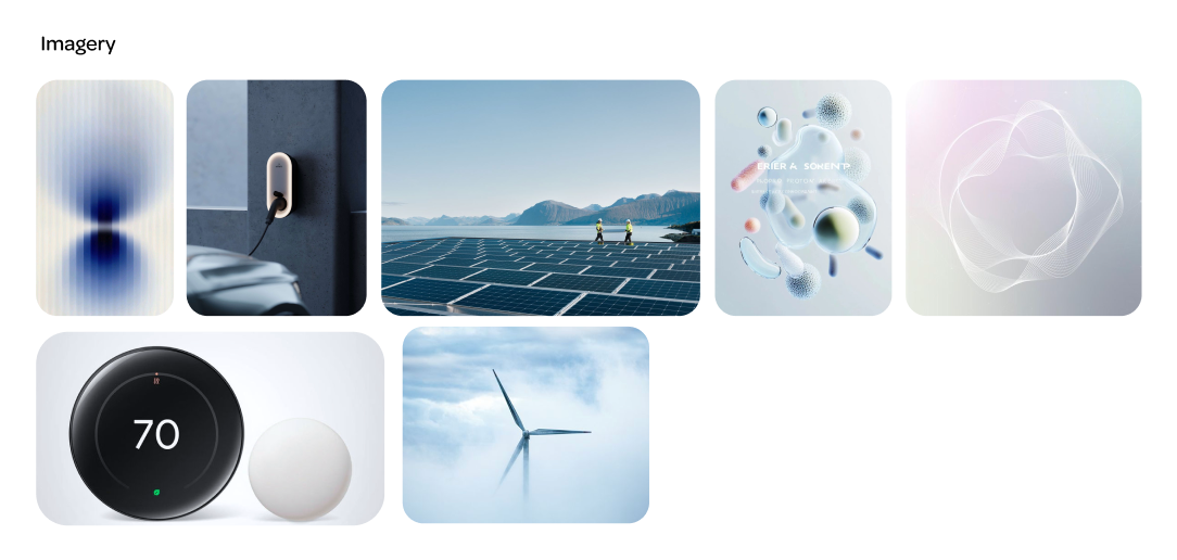
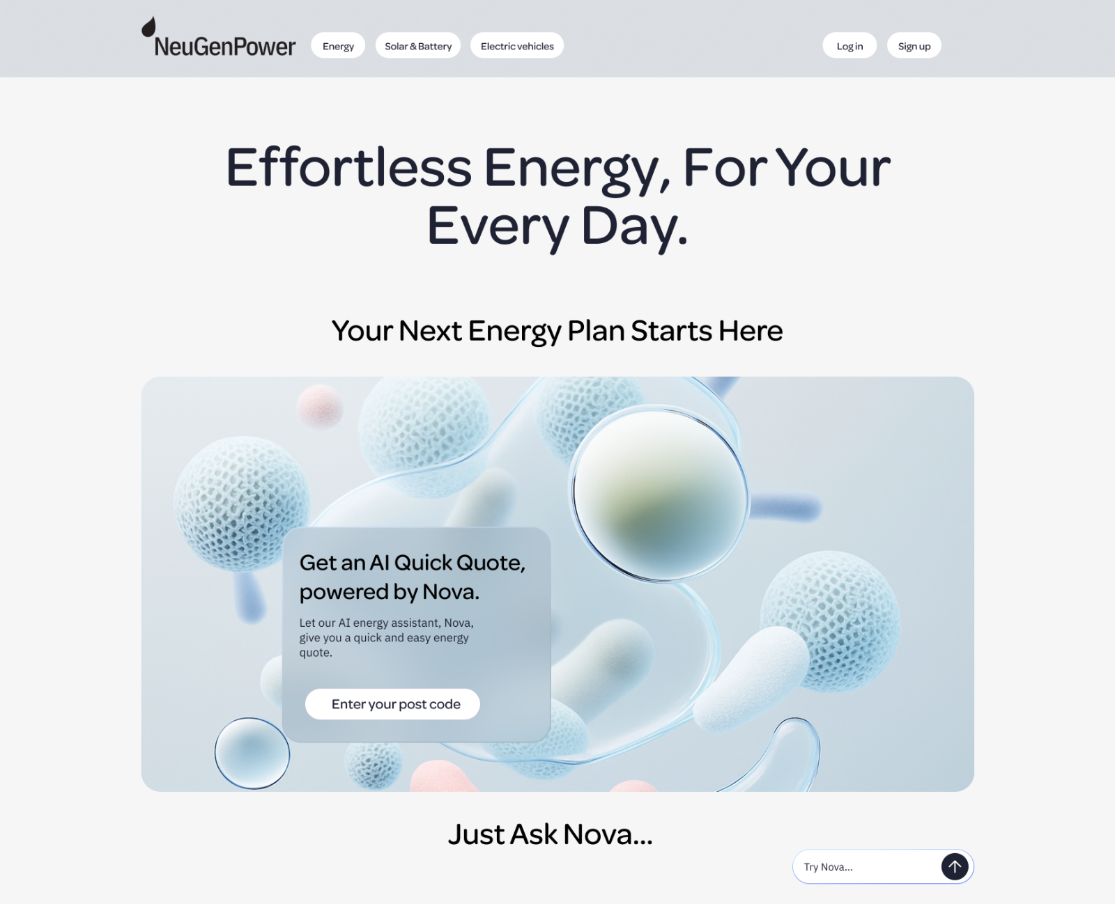
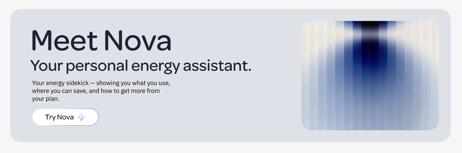
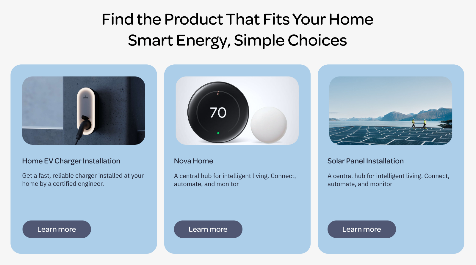
A sticky frosted-glass navigation bar, an AI-assisted quick quote card, a “Try Nova” button, and product cards in a distinct blue, all set against strong, monolithic imagery.
Dashboard and Nova chat
Users can explore working graphs while chatting to Nova about their insights. Suggested prompts are written for each persona:
- “Compare weekday vs weekend usage.” for Gavin
- “Estimate my savings if I switch to LED bulbs.” for Sarah
- “Any tips for how to bleed a radiator?” for Jamie
A model switcher shows how system settings would work inside Nova: Nova Sense for analysis and planning, and Nova Current for live insights and actions.